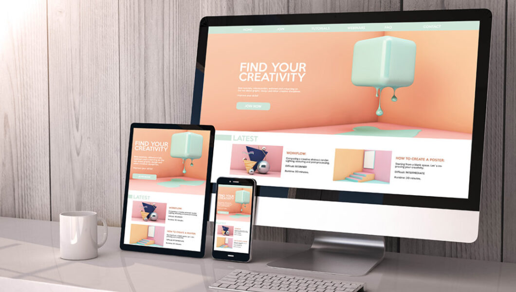
In today’s digital world, users access websites from a variety of devices—smartphones, tablets, laptops, and desktops. That’s why mobile responsiveness is no longer optional; it’s essential. A mobile-responsive website ensures that your pages look great and function smoothly on every screen size, enhancing user experience and improving search engine rankings. Let’s explore how to design a mobile-responsive website step by…

Web Technologies

Hire Front-End Developer in Hyderabad Are You Looking to hire expert Front-End developers for developing, customizing, or managing your prjects? Look no further, Bhavya Web Tech is your reliable partner. Get started with us today! 5 Reasons to Hire Front-End Developer from Bhavya Web Technologies in Hyderabad Expertise in Modern Technologies Our front-end developers in Hyderabad specialize in cutting-edge technologies…

How to Create and View a Web Page on Your Computer Creating and viewing a webpage on your computer is an exciting way to explore web development. Whether you’re a beginner or just experimenting, the process is straightforward and rewarding. Here’s a step-by-step guide to help you create and view a simple webpage on your computer. Step 1: Set Up…

A clear and comprehensive return policy is essential for building trust with customers and ensuring smooth transactions. It defines the terms under which customers can return or exchange products, protecting both the business and the buyer. Crafting a well-thought-out return policy can improve customer satisfaction and boost your reputation. Here’s a complete guide to writing one. Understand the Purpose of…

Creating a website outline template is an essential step in planning your site’s structure, organizing content, and ensuring a smooth user experience. A clear website outline provides a roadmap that helps you visualize your site’s layout and makes the design and development process easier. Here’s a guide on how to create a website outline template with essential steps and a…

Introduction For startups and small businesses, a professional website is essential to build a strong online presence, attract customers, and compete in the digital marketplace. But with limited budgets and resources, finding a reliable web design agency that understands small business needs is crucial. Fortunately, many web design agencies specialize in working with startups and small businesses, offering affordable yet…

For web designers and developers, staying current with trends, techniques, and tools is essential. Attending conferences, workshops, and industry events not only provides valuable learning opportunities but also offers a chance to network with like-minded professionals from around the globe. Here are some of the best web design events in 2024 that are worth adding to your calendar! Awwwards Conference…

In the competitive world of web design, creativity and usability are key to standing out. If you’re looking for inspiration to design your own agency website, or simply curious about the best in the industry, some companies truly set the standard. These websites not only showcase cutting-edge design trends but also provide exceptional user experiences that leave lasting impressions. Let’s…

Mastering website development projects is about more than just delivering a functional, visually appealing website; it’s also about cultivating strong, lasting client relationships that lead to retention and repeat business. In a competitive digital landscape, clients seek developers who not only provide high-quality work but also understand their business goals, communicate effectively, and offer ongoing support. By focusing on project…

Working with non-technical clients in web development projects can be a rewarding yet challenging experience. Often, these clients have a vision for their website or application but may not fully understand the technical processes involved in bringing that vision to life. Effective communication, patience, and empathy are essential to bridge this gap and ensure a smooth collaboration. For web developers,…