By Bhavya Web Technologies
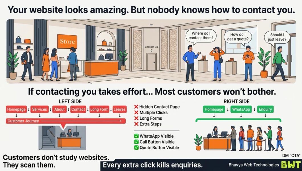
You spent weeks designing your website.
The colors are perfect.
The animations are smooth.
The typography is modern.
The layout feels premium.
But there’s one problem.
A potential customer lands on your homepage and asks:
“How do I contact this business?”
If the answer isn’t immediately obvious, you may be losing leads every single day.
Because in 2026, customers don’t study websites.
They scan them.
And if contacting you requires effort, many won’t bother.
The Biggest Website Mistake Nobody Talks About
Many business owners assume visitors will naturally explore their website.
They imagine users clicking:
- Home
- About Us
- Services
- Portfolio
- Contact
- Enquiry Form
In reality, most people don’t browse that patiently.
They want answers quickly.
If they can’t find a way to message, call, or request a quote within seconds, they’ll often leave and try another business.
The issue isn’t your service.
It’s the friction in your customer journey.
Every Extra Click Costs You Potential Customers
Imagine walking into a physical store and wanting to ask a question.
Instead of seeing a salesperson, you’re told to:
- go upstairs
- fill out paperwork
- wait in line
- return tomorrow
You’d probably leave.
The same thing happens online.
A visitor who has to:
❌ Open multiple pages
❌ Search for contact details
❌ Fill out a long form
❌ Hunt for your phone number
may decide it’s easier to contact someone else.
Convenience often wins.
Customers Don’t Want to Search. They Want to Act.
Modern users expect immediate access to businesses.
They want to:
- send a WhatsApp message
- call with one tap
- request a quote
- book a consultation
The easier these actions are, the more likely they are to happen.
Your website should remove obstacles—not create them.
Why Great Design Isn’t Enough
A beautiful website can create a strong first impression.
But beauty alone doesn’t generate enquiries.
Conversion happens when visitors understand:
- what you do
- why they should trust you
- how to take the next step
If the path to action is hidden, even an award-winning design can underperform.
Your website isn’t just there to impress people.
It’s there to help them make a decision.
The Psychology of Friction
Every additional step creates an opportunity for hesitation.
A visitor may think:
- “I’ll contact them later.”
- “This is taking too long.”
- “I’ll check another company first.”
Many never come back.
Reducing friction is one of the simplest ways to improve conversion rates without increasing traffic.
Make Contact Options Impossible to Miss
Here are practical improvements that often increase enquiries.
1. Keep WhatsApp Visible
If WhatsApp is an important sales channel, don’t hide it on the contact page.
Use a persistent button that’s easy to find on both desktop and mobile.
2. Display Your Phone Number Clearly
If phone calls matter to your business, make the number visible in the header or another prominent location.
Avoid forcing users to dig through menus.
3. Use Action-Oriented Buttons
Compare these:
❌ Contact
❌ Submit
❌ Click Here
With:
✅ Get Free Quote
✅ Talk to an Expert
✅ Book a Free Consultation
The second group tells users exactly what they’ll receive.
4. Shorten Your Forms
Every additional field increases effort.
Ask only for information you genuinely need to begin the conversation.
You can gather more details later.
5. Offer Multiple Contact Methods
Different customers prefer different channels.
Consider offering:
- phone
- enquiry form
- meeting scheduler
Choice improves accessibility and convenience.
Design for Impatient Customers
Many websites are built from the business owner’s perspective.
The owner already knows:
- what the company does
- how to get in touch
- where information lives
First-time visitors don’t.
They arrive with limited patience and limited context.
That’s why the best websites are designed around customer behavior—not internal assumptions.
Run This 60-Second Test
Open your website on your phone.
Pretend you’ve never seen it before.
Start a timer.
Can you, within one minute:
- understand what the business offers?
- find a way to contact it?
- request a quote or start a conversation?
If the answer is no, your customers are likely experiencing the same frustration.
And that frustration can quietly reduce conversions.
Simplicity Converts Better Than Complexity
Businesses often spend heavily on:
- redesigns
- animations
- visual effects
- branding refreshes
While overlooking one of the highest-impact improvements:
Making it easier for customers to reach them.
Sometimes adding a prominent WhatsApp button or simplifying a contact form delivers more business value than an expensive visual overhaul.
Final Thought
A great website doesn’t just look professional.
It guides visitors toward action.
If people have to search for your contact details, wonder how to request a quote, or navigate multiple pages before reaching you, you’re introducing unnecessary friction into the buying process.
The businesses generating more enquiries aren’t always the ones with the flashiest websites.
They’re often the ones that make taking the next step effortless.
So ask yourself one simple question:
If I were a first-time visitor, could I contact my business in a single click?
If not, your next website improvement may already be obvious.
Bhavya Web Technologies
Kukatpally, Hyderabad