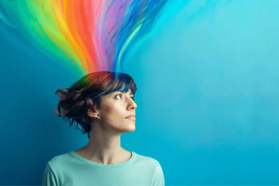
Color is one of the most powerful elements in web design. It communicates emotions, guides user actions, and even influences purchasing decisions—often without users realizing it. Whether you’re designing a website for a business, brand, portfolio, or eCommerce store, understanding the psychology of colors can help you create a more engaging and effective user experience.
In this article, we’ll explore how colors impact user behavior, what different colors represent, and how you can strategically use color theory in your web design.
1. Why Colors Matter in Web Design
Colors are more than just visual appeal—they trigger psychological responses. Research shows that up to 90% of first impressions are influenced by color alone. This makes color choice a crucial part of UX and branding.
Colors Affect:
-
User mood
-
Readability
-
Brand perception
-
Conversion rates
-
Navigation flow
The right color combination creates harmony and balance, while the wrong colors can confuse or overwhelm users.
2. The Meaning of Colors in Web Design
Each color evokes a different emotional response. Here’s what the most common web design colors represent:
🔵 Blue — Trust & Professionalism
Blue is one of the most popular colors in web design. Brands like Facebook, LinkedIn, and PayPal use it for a reason.
Common Associations:
-
Security
-
Trust
-
Calmness
-
Logic
Best For: Corporate websites, finance, tech, healthcare.
🔴 Red — Energy & Urgency
Red grabs attention instantly. It triggers strong emotions and increases the heart rate.
Common Associations:
-
Passion
-
Urgency
-
Excitement
Best For: Sales, advertisements, eCommerce CTAs like Buy Now buttons.
🟡 Yellow — Optimism & Warmth
Yellow brings positivity but should be used carefully, as too much can cause visual strain.
Common Associations:
-
Happiness
-
Creativity
-
Cheerfulness
Best For: Creative agencies, children’s brands, food industry.
🟢 Green — Growth & Balance
Green is soothing and associated with nature and stability.
Common Associations:
-
Health
-
Environment
-
Wealth
Best For: Wellness brands, organic products, eco-friendly sites.
🟣 Purple — Luxury & Imagination
Purple has a premium feel and works well for brands targeting creativity and elegance.
Common Associations:
-
Royalty
-
Wisdom
-
Innovation
Best For: Beauty brands, luxury products, educational platforms.
🟠 Orange — Enthusiasm & Motivation
Orange is energetic and stimulating but less overwhelming than red.
Common Associations:
-
Confidence
-
Friendliness
-
Motivation
Best For: Startups, marketing websites, e-learning platforms.
⚫ Black — Power & Sophistication
Black gives a clean, modern, and high-end feel when used with minimalist layouts.
Common Associations:
-
Strength
-
Elegance
-
Authority
Best For: Fashion brands, luxury products, portfolios.
⚪ White — Simplicity & Cleanliness
White space (negative space) is essential in modern web design.
Common Associations:
-
Minimalism
-
Freshness
-
Clarity
Best For: All website types—improves readability and structure.
3. How Color Affects User Behavior
Colors directly influence the way users interact with your website.
✔ Conversion Rates
-
Red or orange buttons often increase urgency
-
Green buttons encourage positive action (“Go”, “Start”, “Proceed”)
✔ Navigation
Color can guide users to key areas like menus, forms, or offers.
✔ Branding
Consistent colors help users remember your brand.
For example:
-
You think blue → Facebook
-
You think red → YouTube
-
You think yellow → McDonald’s
✔ Trust & Credibility
Cool colors like blue and green build trust and calmness.
4. Tips for Using Color Psychology in Web Design
1. Stick to a Consistent Color Palette
Use 2–4 primary colors for a clean and professional look.
2. Use Contrast for Readability
Dark text on a light background works best.
3. Highlight Call-to-Action Buttons
Use contrasting, attention-grabbing colors such as:
-
Red
-
Orange
-
Green
4. Consider Your Audience
Certain cultures interpret colors differently.
For example, red symbolizes luck in Asian cultures but danger in Western cultures.
5. Maintain Accessibility
Use accessible color contrast ratios (WCAG guidelines) to support all users.
5. Tools to Help Choose Colors
Here are some excellent tools:
-
Adobe Color
-
Coolors.co
-
Canva Color Palette Generator
-
Paletton
-
Material UI Color Tool
These tools help you create combinations that are harmonious and effective.
Conclusion
The psychology of colors plays a crucial role in shaping user experience. By understanding the emotions each color evokes and aligning them with your brand message, you can create a website that is not only visually appealing but also psychologically engaging.
When used strategically, colors can:
-
Improve branding
-
Boost conversions
-
Enhance UX
-
Influence user decisions
Start experimenting with color combinations today—and watch how your audience responds.