
In web design, typography plays a crucial role in how users perceive and interact with your website. Even the most visually stunning website can fail if the text is hard to read. Good typography enhances user experience, keeps visitors engaged, and ensures your content is easily digestible.
In this article, we’ll explore practical typography tips to improve website readability and create a more user-friendly web experience.
1. Choose Readable Fonts
Selecting the right font is the foundation of good typography. Here’s what to consider:
- Sans-Serif Fonts: Fonts like Arial, Helvetica, and Open Sans are clean and easy to read on screens.
- Limit Font Families: Use 2–3 fonts maximum to maintain visual consistency.
- Avoid Decorative Fonts for Body Text: Fancy fonts are suitable for headings or logos but can reduce readability if overused.
2. Optimize Font Size
Font size greatly affects readability. Recommendations:
- Body Text: 16px is generally considered the minimum for comfortable reading on desktop.
- Headings: Use larger font sizes to create hierarchy and guide the reader.
- Responsive Design: Ensure font sizes adjust for mobile and tablet screens.
3. Maintain Proper Line Height
Line height (or leading) prevents text from feeling cramped. Proper spacing between lines improves readability and reduces eye strain.
- Ideal line height: 1.4–1.6 times the font size
- Avoid line heights that are too tight or too loose, as they can confuse the reader’s eye flow
4. Use Adequate Letter Spacing
Letter spacing (tracking) affects the clarity of your text:
- Slightly increased letter spacing improves readability for headings and all caps text.
- Avoid excessive spacing that makes words disjointed.
5. Maintain Contrast Between Text and Background
Good contrast ensures your text is legible on any background:
- Dark text on a light background works best for body content.
- Use contrast ratios of at least 4.5:1 for standard text (WCAG guidelines).
- Avoid using bright colors that strain the eyes.
6. Limit Line Length
Lines that are too long or too short make reading difficult. Recommendations:
- Optimal line length: 50–75 characters per line
- Shorter lines for mobile devices improve readability.
7. Use Hierarchy and Emphasis
Create a visual hierarchy to guide users through your content:
- Use headings (H1, H2, H3) to structure content.
- Bold or italicize important points to draw attention.
- Consistent heading sizes improve scanning and comprehension.
8. Pay Attention to Paragraph Spacing
Proper spacing between paragraphs helps separate ideas and prevents text from looking overwhelming.
- Use spacing equal to at least 1–1.5 times the line height
- Avoid walls of text; break content into small, digestible sections
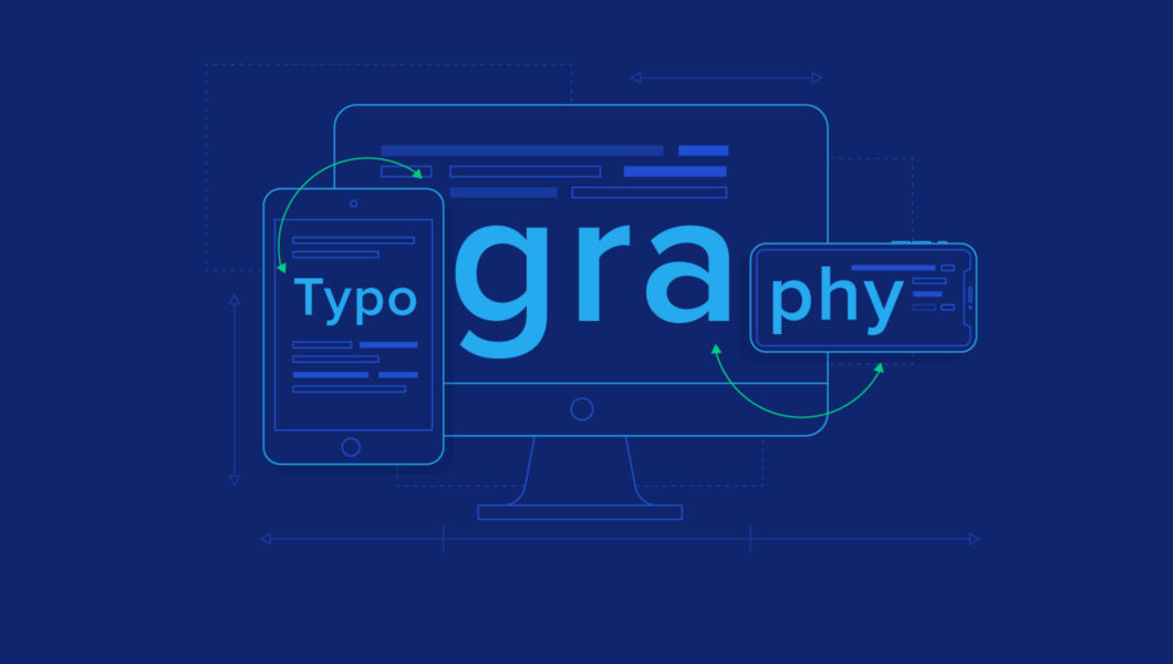
9. Consider Readability on All Devices
Web users access content from multiple devices. Ensure your typography is responsive:
- Test readability on desktops, tablets, and mobile phones
- Adjust font sizes and spacing dynamically using CSS media queries
- Ensure headings and buttons are legible on small screens
10. Test Typography for User Experience
Finally, test your typography choices:
- Conduct user testing to see if visitors can read and navigate your content easily
- Check font rendering across different browsers
- Use tools like Google Fonts Preview and Type Scale to experiment with sizes and spacing
Conclusion
Good typography is more than just making text look pretty—it’s about improving readability, engagement, and user experience. By choosing readable fonts, optimizing font size and spacing, maintaining contrast, and structuring your content properly, you can create a website that keeps visitors reading and exploring.
Start implementing these typography tips today to ensure your website content is not only attractive but also easy and enjoyable to read.