By Bhavya Web Technologies
Many business owners assume their competitors are winning because they have a better product, a bigger team, or a larger marketing budget.
Sometimes that’s true.
But very often, the real reason is much simpler:
They’re easier to do business with.
In a world where customers expect instant answers and effortless experiences, reducing friction can be more powerful than increasing advertising spend.
The companies that make buying simple often outperform companies that make buying complicated.
Imagine This Scenario
A customer is looking for a website development agency.
They visit two websites.
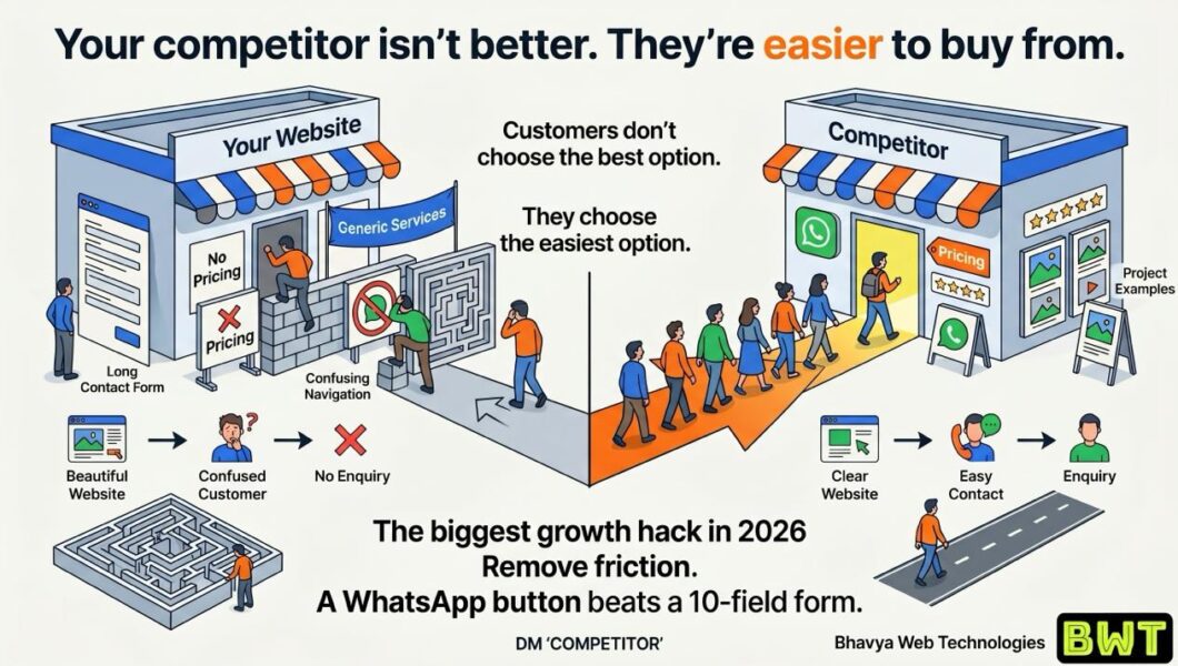
Website A
- No pricing guidance
- Long contact form with 10 required fields
- Generic descriptions like “Innovative Digital Solutions”
- No WhatsApp or quick contact option
- Few examples of previous work
Website B
- Clearly explains its services
- Shows real client projects
- Displays testimonials
- Offers a visible WhatsApp button
- Has a simple “Get a Free Quote” form
Which business is more likely to receive the enquiry?
For many customers, the answer has little to do with technical capability.
It has everything to do with convenience and confidence.
Customers Don’t Always Choose the Best Option
Business owners often believe customers carefully compare every feature and specification before making a decision.
In reality, many people choose the option that feels easiest.
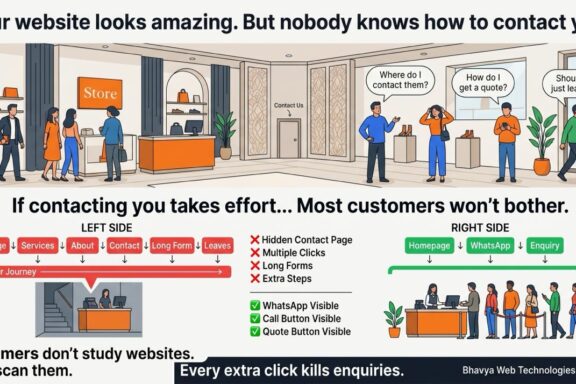
If contacting your company takes effort, visitors may postpone the enquiry—or move on to a competitor.
Ease influences action.
And action drives sales.
The Hidden Cost of Friction
Friction is anything that slows down or complicates the customer journey.
Examples include:
- confusing navigation
- long forms
- hidden contact information
- unclear pricing
- vague messaging
- multiple unnecessary steps
Each obstacle gives visitors another reason to leave.
Even small frustrations add up.
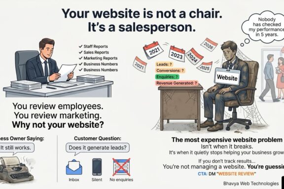
Why Simplicity Wins
The best user experiences reduce decisions instead of adding them.
Customers appreciate websites that answer questions quickly:
- What do you offer?
- Who is it for?
- How much might it cost?
- How can I contact you?
- What happens next?
When these answers are easy to find, people are more likely to continue.
A WhatsApp Button vs. a 10-Field Form
Consider two approaches to generating enquiries.
Long Contact Form
Visitors must enter:
- full name
- company
- phone number
- address
- budget
- project details
- industry
- timeline
- additional notes
That’s a lot of work before they’ve even spoken to you.
WhatsApp or Quick Chat
Visitors tap one button and start a conversation.
No lengthy process.
No unnecessary barriers.
The second approach often feels faster and more approachable, especially for mobile users.
The lesson isn’t that forms are bad.
It’s that unnecessary friction reduces conversions.
Clear Offers Beat Clever Slogans
Many businesses use homepage headlines such as:
❌ “Leading Provider of Innovative Solutions”
❌ “Your Trusted Digital Partner”
These phrases sound polished but don’t explain the value.
A clearer alternative might be:
✅ “Custom Business Websites Delivered in 7 Days”
Or:
✅ “Industrial Automation Solutions for Manufacturing Plants Across India”
Specific language helps customers understand what you do immediately.
Show, Don’t Just Tell
People trust evidence more than claims.
Instead of saying you’re experienced, demonstrate it through:
- project galleries
- customer testimonials
- case studies
- certifications
- team introductions
- client logos (where permitted)
These elements make buying feel less risky.
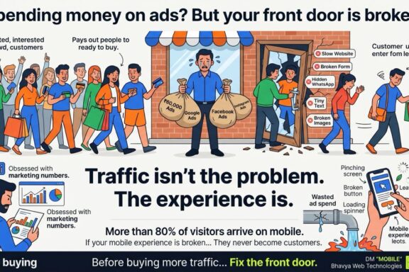
Speed Matters Too
Convenience isn’t only about forms.
It also includes:
- fast-loading pages
- mobile-friendly design
- intuitive navigation
- visible contact options
- clear calls-to-action
Every extra click or delay increases the chance that a visitor abandons the process.
Conduct a Friction Audit
Open your website and pretend you’re a first-time customer.
Ask yourself:
- Can I understand the service within five seconds?
- Can I find pricing or request a quote easily?
- Is there an obvious way to contact the business?
- Are there real examples of previous work?
- Does the site inspire confidence?
If the answer to any of these questions is “no,” you’ve found an opportunity to improve conversions.
Small Changes Can Have a Big Impact
You don’t always need a complete redesign.
Often, incremental improvements make the biggest difference:
- Replace “Submit” with “Get Free Quote”
- Add a WhatsApp chat option
- Shorten enquiry forms
- Display customer reviews prominently
- Use specific headlines instead of generic slogans
- Include real project photos and team information
These adjustments reduce friction and help visitors move from interest to action.
Final Thought
Your competitor may not have a better product.
They may not have a larger team.
They may not even spend more on marketing.
They might simply make it easier for customers to say “yes.”
In today’s digital world, convenience builds momentum.
Clarity builds trust.
And trust turns visitors into enquiries.
So before increasing your marketing budget, ask yourself one important question:
How easy is it for someone to become my customer?
Because the biggest growth hack in 2026 may not be attracting more visitors.
It may be removing the obstacles that stop them from contacting you.
Bhavya Web Technologies
Kukatpally, Hyderabad