ProductDesignSystems
Building cohesive, tokenized UI component systems that accelerate engineering velocity, ensure multi-brand consistency, and scale seamlessly.
UI/UX & Product Design
12 ServicesRequest a Proposal
Centralized UI Component Architecture Built for Velocity and Brand Cohesion
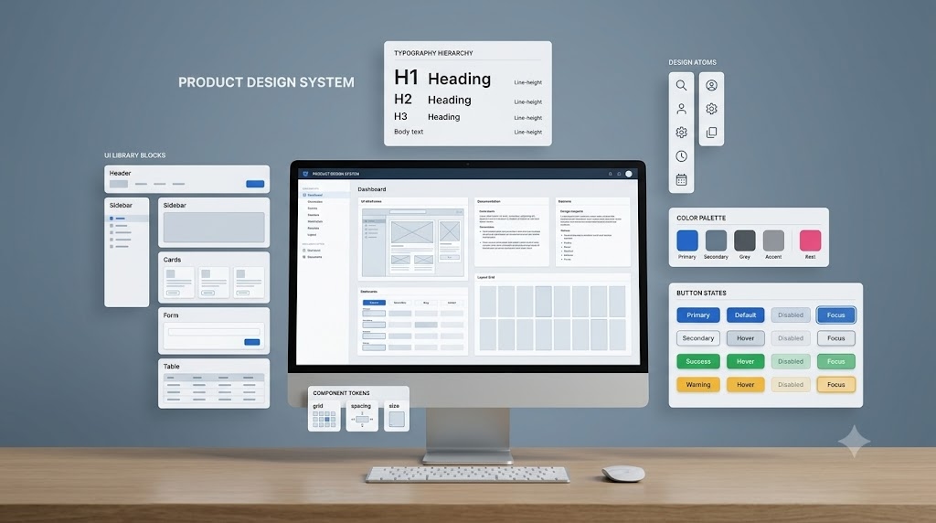
In fast-moving digital products, fragmented design patterns cause development bottlenecks, UX inconsistencies, and costly technical debt. At Bhavya Web Tech, we engineer enterprise-grade design systems that bridge the gap between design and engineering. By structuring comprehensive token libraries, reusable components, and strict governance rules, we empower your product team to ship high-quality features up to 3x faster.
Our design systems are grounded in atomic design principles and modern Figma token architectures. We define semantic color hierarchies, responsive typography scales, dynamic spacing grids, and accessible interactive states. With seamless synchronization to development frameworks like Tailwind CSS, React, and Storybook, your product maintains pixel-perfect visual integrity across web, iOS, and Android ecosystems.
Why Scalable Product Design Systems Drive Measurable Business ROI
A unified design system is an essential infrastructure investment for modern software organizations. Without a centralized single source of truth, engineering teams spend valuable sprint hours rebuilding existing components, resulting in visual drift and disjointed user experiences.
We build robust, documented component libraries in Figma that integrate directly with your tech stack. By implementing W3C-compliant design tokens, cross-platform theme switching (such as dark mode and multi-tenant branding) happens instantaneously at the code level.
From initial design audits to Storybook synchronization and team governance training, Bhavya Web Tech ensures your product system scales gracefully as your engineering organization expands.
Core Features
Atomic Component Architecture
Scalable component hierarchy structured from foundational atoms to complex organisms and responsive templates.
Figma Variable & Tokenized Systems
Centralized design tokens for colors, typography, spacing, elevations, and radius that synchronize effortlessly with code.
Multi-Brand & Dark Mode Theming
Dynamic theme switching capabilities enabling effortless white-labeling, multi-tenancy, and high-contrast dark modes.
WCAG 2.1 AA Accessibility Standards
Built-in color contrast compliance, keyboard focus rings, and screen-reader accessible interaction states.
Storybook & Developer Handoff
Comprehensive component documentation, interactive props tables, and clean code snippets for React, Vue, or Web Components.
System Governance & Versioning
Clear contribution workflows, deprecation lifecycles, and component release management to prevent design drift.
Why Partner With Us?
Our Strategic Workflow
We utilize a highly refined, transparent, and step-by-step methodology designed to ensure absolute precision and flawless delivery of your enterprise project.
UI Audit & Token Definition
We catalog your existing screens to identify inconsistencies, consolidate redundant patterns, and define global design tokens for typography, color, spacing, and elevation.
Atomic Component Library Construction
We build fully responsive, accessible component sets in Figma using auto-layout, interactive variants, and slot architectures tailored for rapid prototyping.
Storybook Integration & Governance Handoff
We map Figma tokens to developer variables, document component usage guidelines, and train your product squad on long-term system governance.
Frequently Asked Questions
Ready to build high-performance Product Design Systems?
Tell us about your project goals, timelines, and requirements. Our design & engineering team will deliver a structured roadmap within 24 hours.